Background
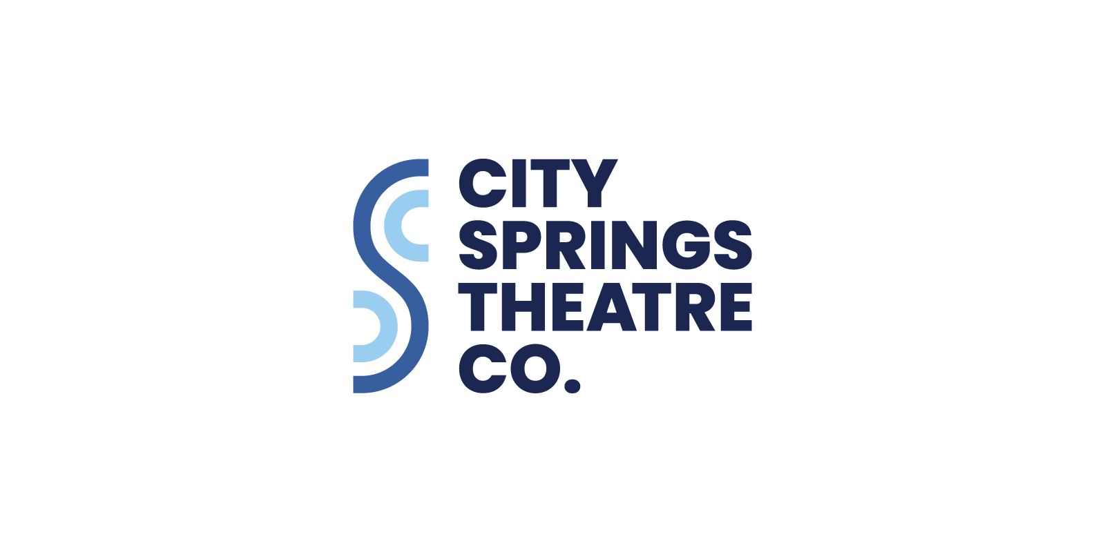
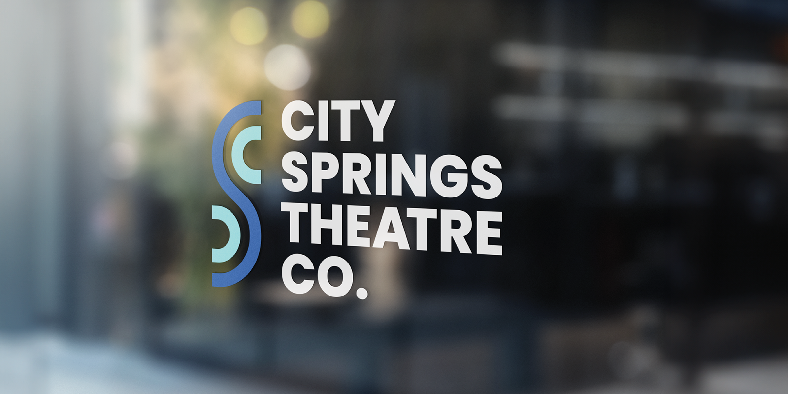
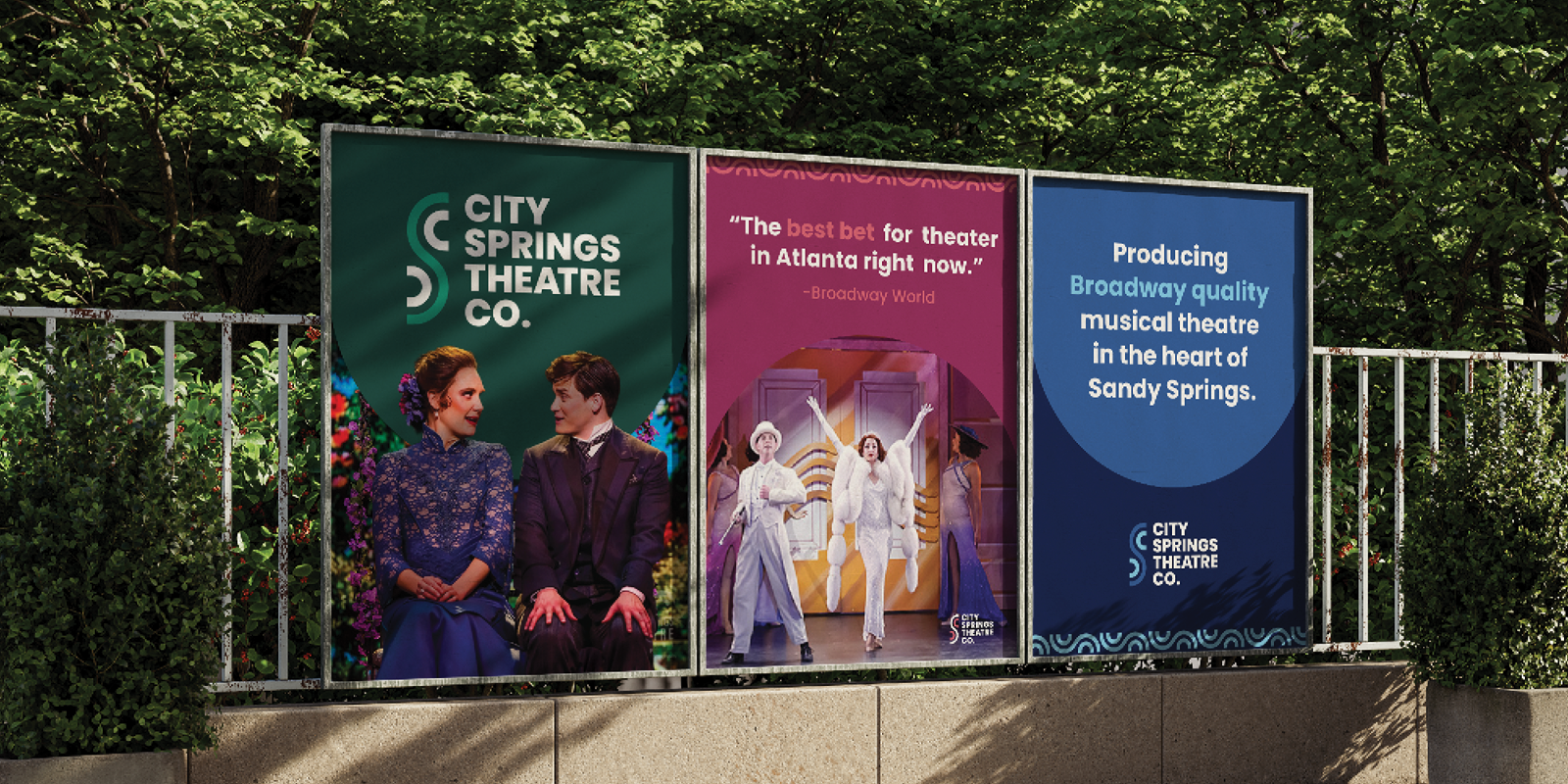
While freelancing with GO Agency, I was tasked with creating a logo for City Springs Theatre Company. The goal was to strike a balance between sophistication and playfulness, reflecting the diverse nature of their shows. Additionally, the logo needed to be adaptable to different color schemes used for each production.
Process
The client was hesitant about a complete rebrand, so I took inspiration from their existing logo. I reimagined the waves as a unique shape that would complement their name. They also might be seen as a C S and T, all letters in the company’s name; or as a smile and a frown when horizontal to suggest the association with theatre.
Outcome
The logo is still under consideration, but it's currently the client's favorite after the first round of revisions!
Created in collaboration with Vivian Chu at GO Agency